Home
andrew bardzik
Inter 12

Understanding the whole tradition of copying in todays culture, as well as its us in the past, was one of the first things undertaken into understanding the many form that copying, replicating, re-enacting and reconstruction, etc.. come in. This year involved me undertaking the units brief of copying as well as the research done and combine together with my interest into modernist architecture. The journey also sparked of some interest into psychology as well as the use of horror movies as theme on which to build on. This year has thought me allot, in making me understand more the significance of copying, in that copying something in a xerox and copy & paste way is only the beginning, it's only whether you choose to further the copy to create something that is fresh and new. Of course it depends on you how much you wish to sustain the original sources presence, but in the world of design, simply copying and tweaking is the easy way out. Only by pushing the copy and transforming it in your own way or fashion do you begin to appreciate the usefulness of copying. This year managed to grasp this idea in many of my own experiments. Some did fail and where not pushed enough and required  further investigation and progression, but more importantly that when it comes to copy or duplicating or whatever you want to call it, its all about persistence and redoing that we attain a copy that in itself becomes and original. My final project tries to encompass all these values by creating the phenomena of doppelgänger(an evil twin), in trying to communicate this relationship between the original and the copy, the serene and the fake and demonstrate this using a piece of modernist architecture; The Eames  House.

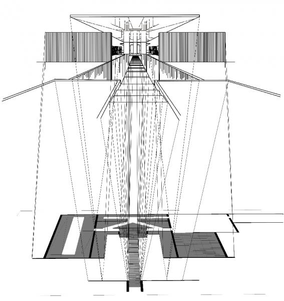
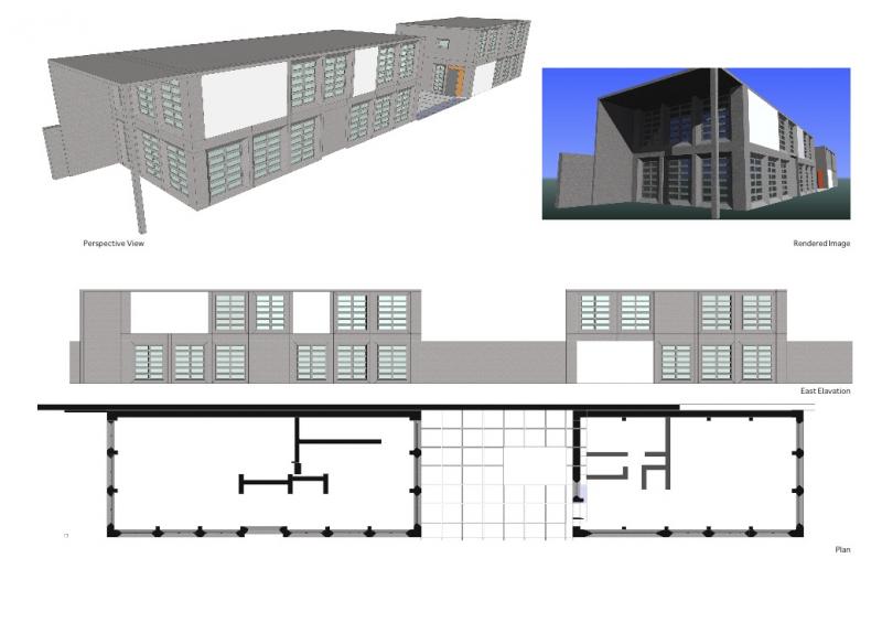
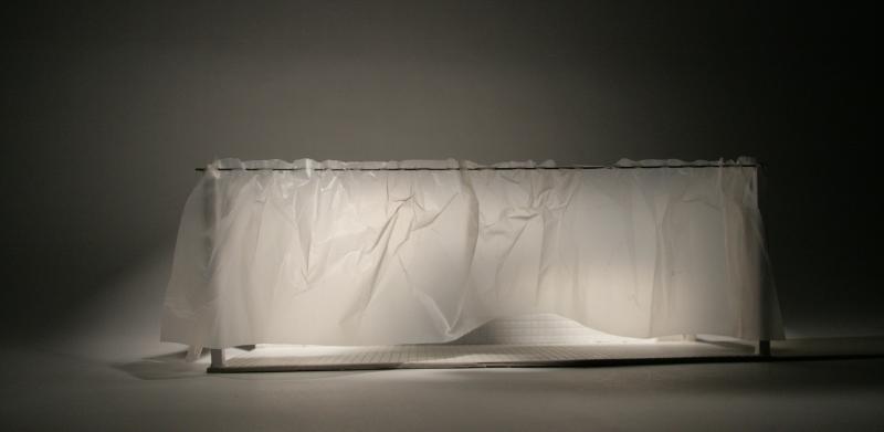
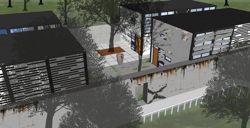
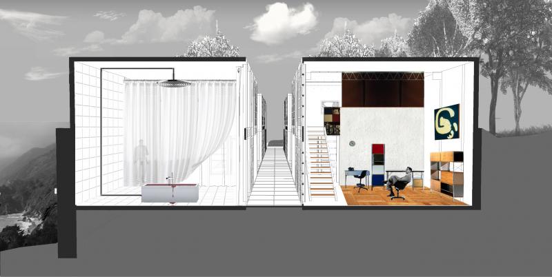
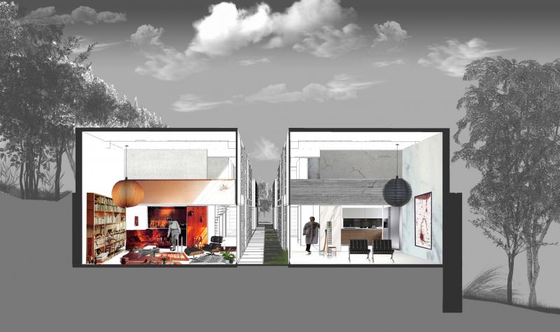
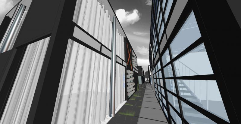
This image was part of a drawing exercise, in which I took a selection of the case study houses and enforced a specific phobia to the houses design and layout. In this example with Case Study House 15, I wanted to apply techniques that would enforce the fear of heights (acrophobia). The addition of mirrors on both the floor and the placement of a mirror on top create the illusion of depth along the path to the main entrance.One of early examples of the transformations of my site (the Eames House). In this example the plan and structural forms of the original house are all copied but are transformed into concrete. This alters the whole light and cheap aesthetic of the original Eames House. Though an interesting idea, this example along with other transformations were put aside as they lacked to show any drive and theme behind their transformations.After choosing to use horror movies as my driving theme for the alteration of the Eames House and help me create a backdrop for my project, I selected Psycho, Repulsion and American Psycho to work with. By studying the movies from an architectural and spatial view I created these five models. Each model takes one of the elements I had picked up on from one of the movies and emphasises it within the shell of the house.One of the examples of the five models created in transforming the Eames House. This model takes the iconic murder scene from Psycho, and effectively takes the void and potentially sinister space of the bathroom and scales it up to the Eames House footprint, ending up with a house-sized shower room  where the other side of the curtain is full of uncertainty.As well as changing the physical aspect of the Eames House, how the object located within the Eames House would transform along with the entire shell was also considered. These drawings are some of the conceptual ideas for the interior Eames furnishings that have undergone a horror alteration.An exterior view of the original Eames in the background and its doppelganger duplicate in the foreground. The unsettling horror elements start to reveal themselves through the cracking walls, the barricaded windows and the overgrown courtyard; all combine to create a disturbing image standing alongside what can be seen as a serene house.The studio space of the Eames on the right is a composed room. With its wooden flooring, colourful furniture and warm character, it is challenged by its twin which represents itself as the empty, cold and threatening room. The rooms engage in a battle for image, between the copy and the original. One can look one way or both ways, but most importantly questions will always be raised about both spaces, which adds to the interesting dialogue the two share.Another section taken through the two living rooms. Both rooms occupy a similar space in area, but communicate two different lifestyles within. The Eames house on the left, contains a warm and home like environment, whilst on the right we have its evil twin with its near empty space, an axe hidden in the background, blood painted within a farm and an all together plain but uneasy feeling.Another exterior view of the complex. Both spaces stretch on the same dimensions in their length and height, but differ so greatly in their communication of the placid and the disturbed. Two images that encompass the interior feelings of both spaces. The contrast and difference is once again evident in the transformation.